
Sticket - Inventory Management Tool
Transforming data silos into connected workflows
My Impact
Created a unified inventory platform that reduced manual work by 50% and improved cross-team collaboration.
Timeline
Sep 2023 - Feb 2024
Role
UX Designer - UX, Branding, Prototyping
Collaboration
Founder
Engineer


Overview
Sticket specializes in sales for entertainment venues, offering professional consignment services to connect local sellers with individual buyers
Problem
The company recongized that manual tracking was leading to losses

10 hr/week wasted
on manual updates

Significant $$ lost
due to human mistakes
30+ spreadsheets
to organize and maintain
Key Contributions
Designed high-fidelity wireframes of five pages
Established style and branding guidlines for consistent user experience
Designed and implemented product landing page on Webflow
Supported creation and maintenance of product requirements documentation
Understanding the business
Problem breakdown
Sticket lacked infrastructure to support growth and scalability
During the initial client meeting, I discovered that the company relies on disconnected spreadsheets that require constant manual updates and clean-up of data. As sales increased and orders became more complex, inefficiencies and errors hindered growth. The current solutions deters from the business's growth goals
Business goals
Scale operations by expanding team capacity and sales volume
Achieve 100% fulfillment rate for all listings before event dates
Enable data-driven decision making through real-time visibility of inventory and resources
Preview of the old experience
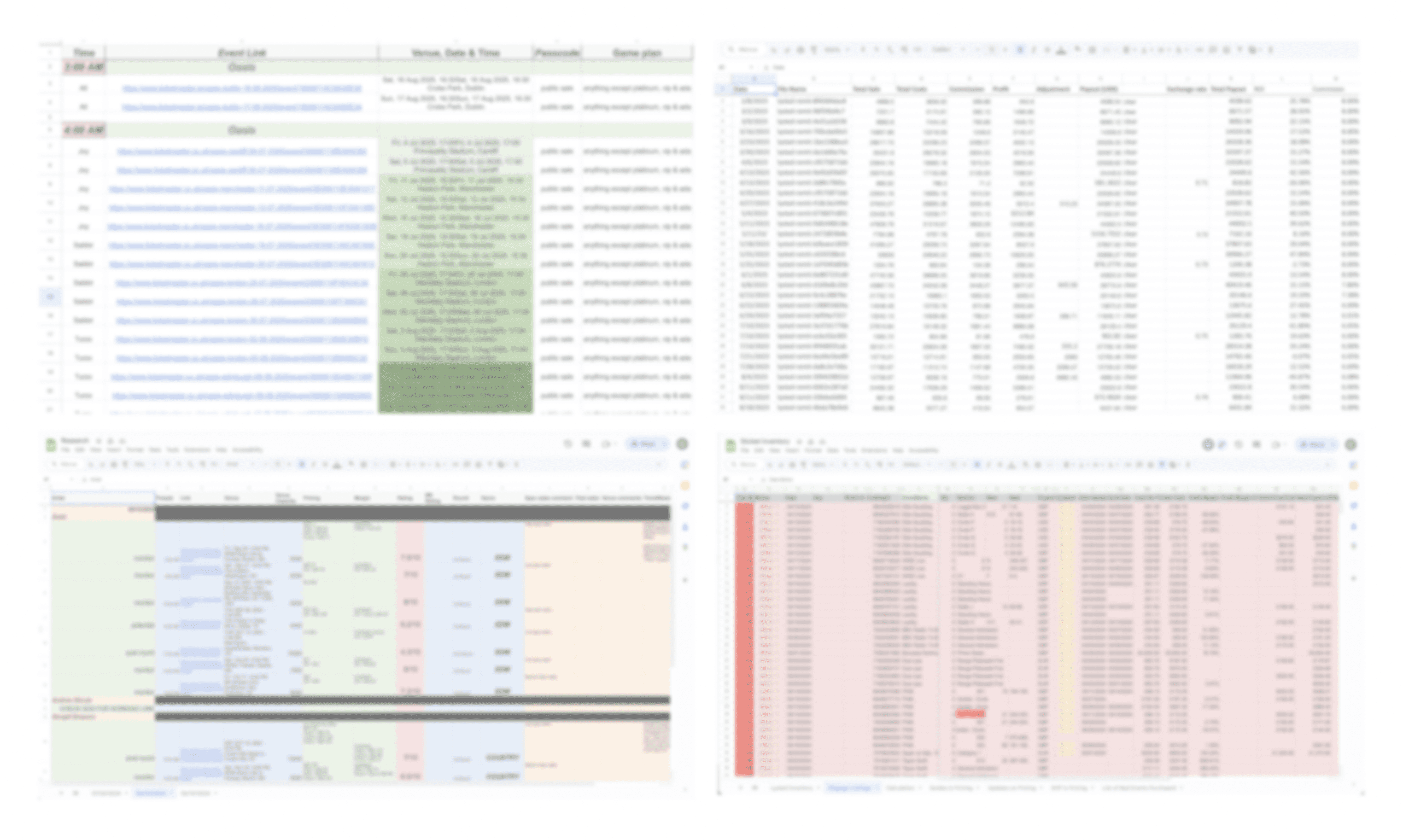
In the current workflow, users have to navigate between spreadsheet files, each are nested with more data sheets within each file
Understanding the Users
It all starts from the people.
I divied into an experience review of the current solution system. After conducting semi-structured interviews with employees from each team, here is what I found:
Key takeaways
🗂️ Lack of a management system to handle large volumes
Current system is inefficient to accommodate large volume of sales
🔎 Difficult to find information due to lack of IA
Kitchen sink of records and data makes historical data difficult to find
🚧 Teams are not integrated into a streamlined workflow
Ad-hoc creation of separate spreadsheets leads to silos
💰 Human errors are costly and a loss of revenue
Data is manually inputted and updated, which is prone to costly mistakes
Design challenge
How might we design an intuitive system that makes inventory data easily discoverable across teams?
Design Goals
The experience review brought forward key design considerations for our soultion.

Discoverability
Optimize information density to allow users to navigate and access data efficiently

Accuracy
Design intuitive user interactions and automate processes to reduce error

Collaboration
Focusing on user jobs and workflows rather than silos of information.
Process
Our target user is comprised of different teams across varying roles in sales, pricing, analysts, operations, finance. Each team is responsible for a different stage of the sales process.
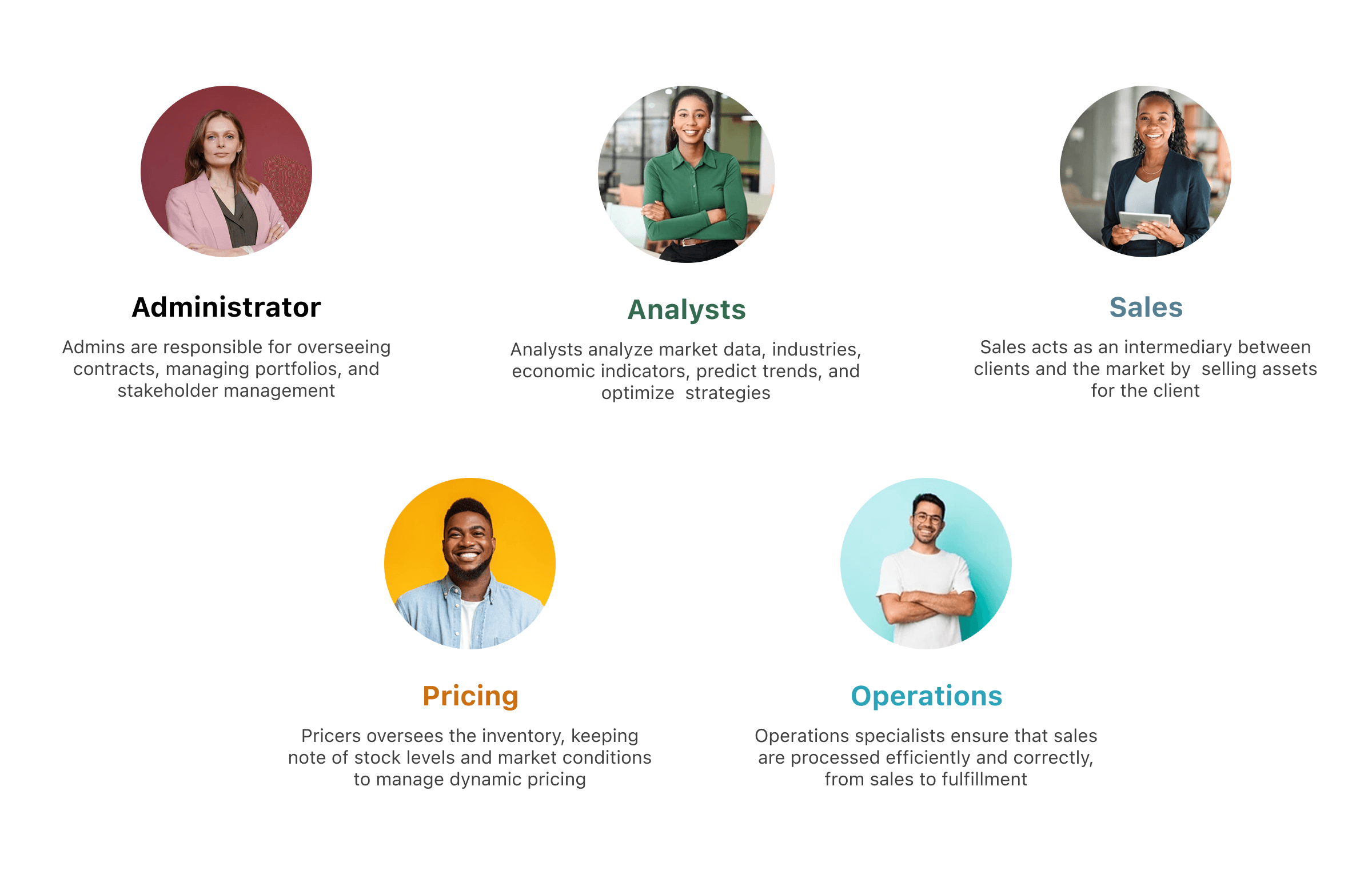
Identifying and prioritizing user jobs
One of my research goals was to understand the main goals and workflows of each role:
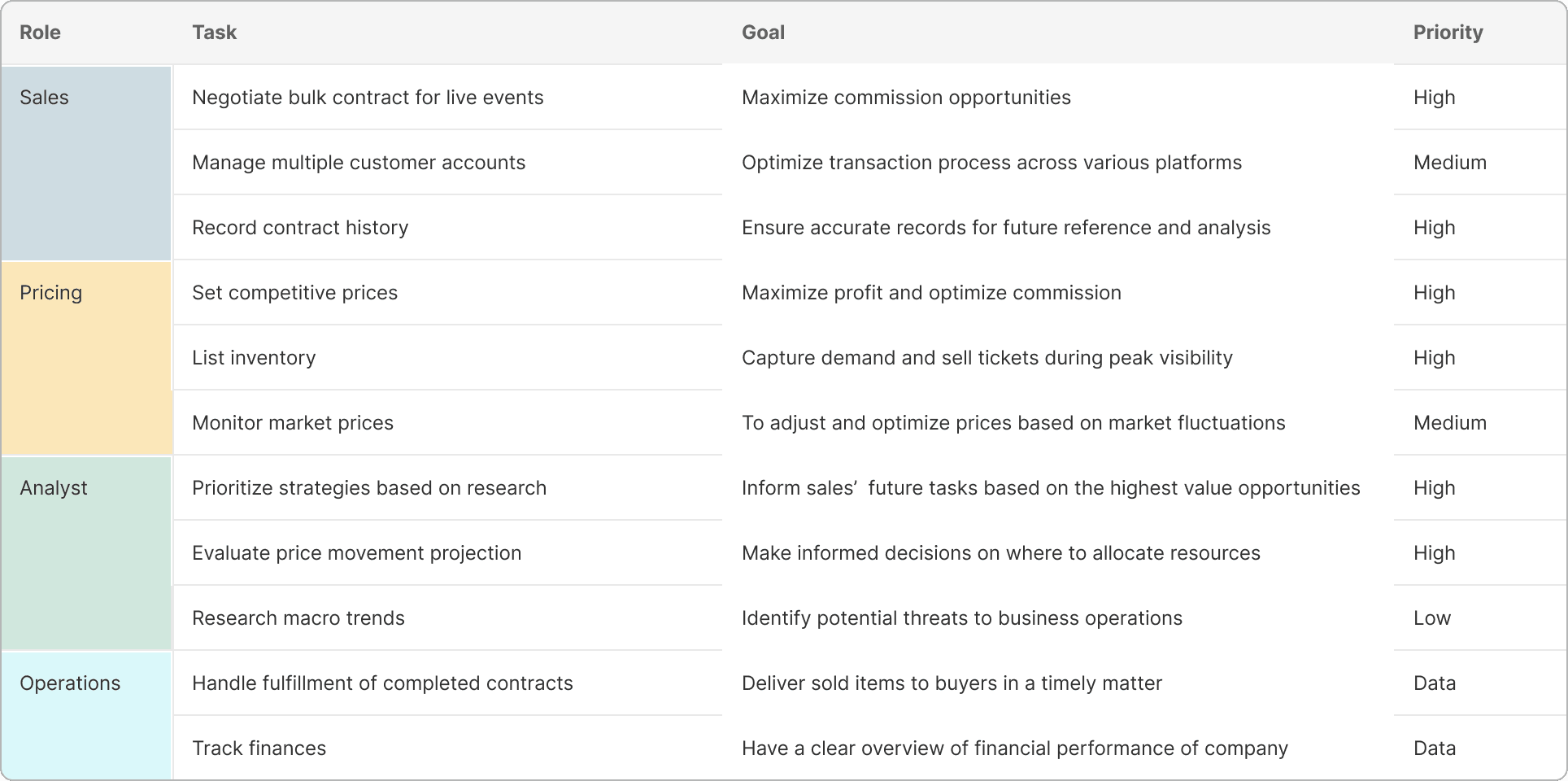
Research revealed the dependencies between each team's workflows
Putting the pieces together, I mapped out a swim lane diagram to visualize the intersections of the collaborative workflows across teams. Notably, multiple feedback loops and team dependencies emerged, highlighting the interconnected journey from listing to fulfillment.
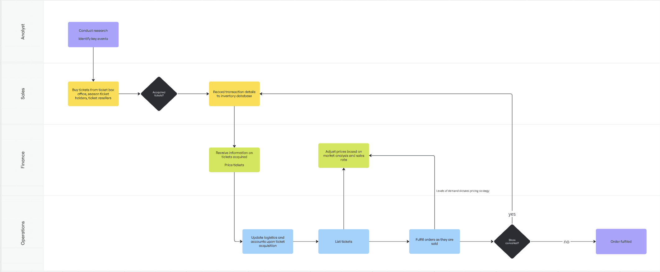
This swimlane diagram visualizes the end-to-end ticket sales process, showing how Analysts, Sales, Pricing, Finance, and Operations teams work in tandem to ensure smooth ticket acquisition, pricing, and fulfillment.
Design process
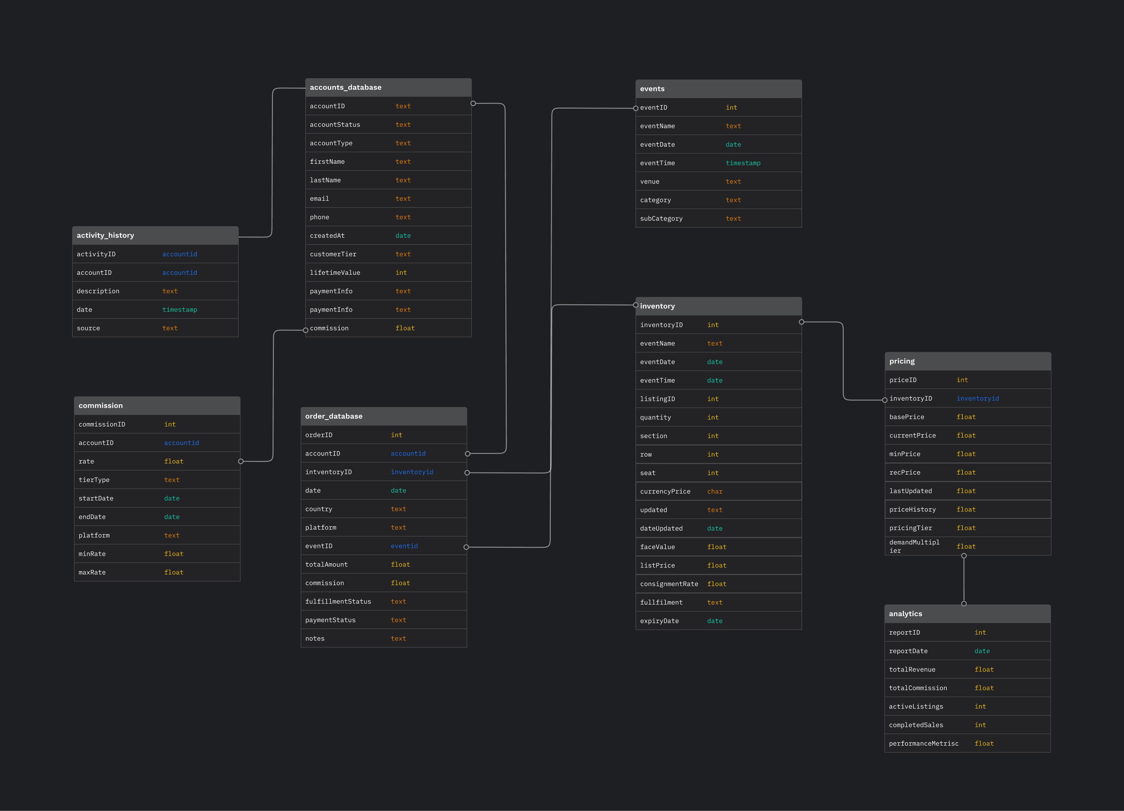
We approached the final solution by building out a database step by step
Based on user research insights, I created a high-level relational database map to visualize which data tables will be linked to each other
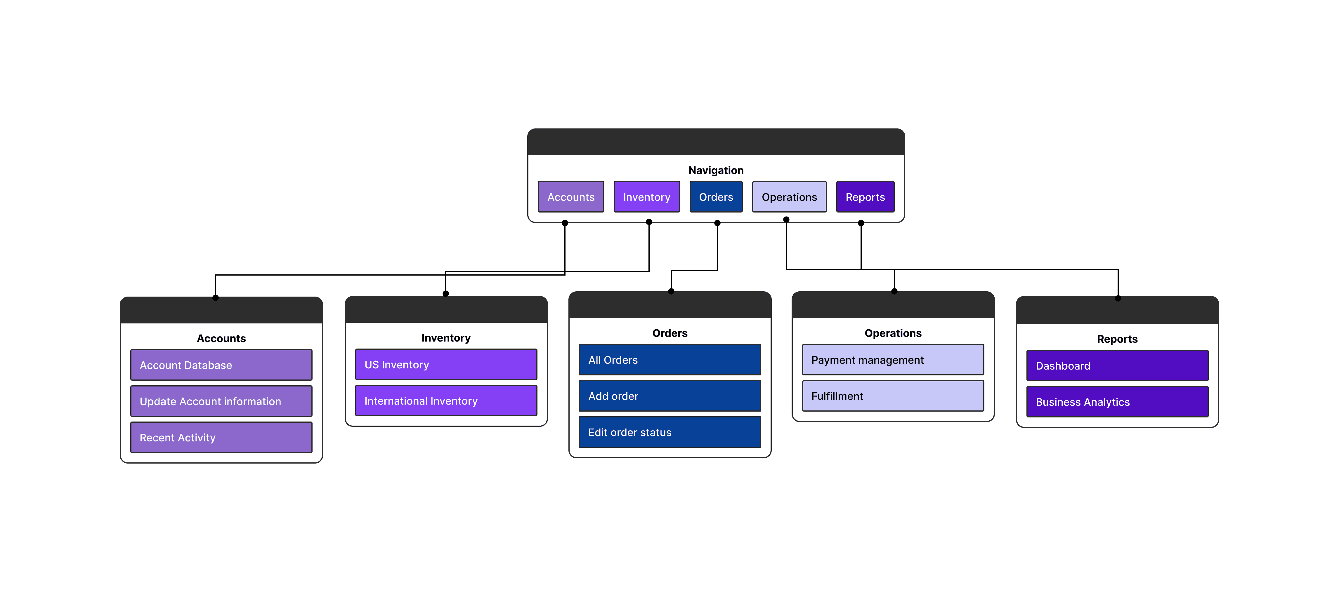
Then, I organized each data table into appropriate pages, creating a site map to outline the overall structure of the platform navigate
Site Map
Low-fidelity exploration
My brainstorming sessions explored various data hierarchy patterns to thoughtfully organize table information, ensuring users could easily access key details without visual overwhelm
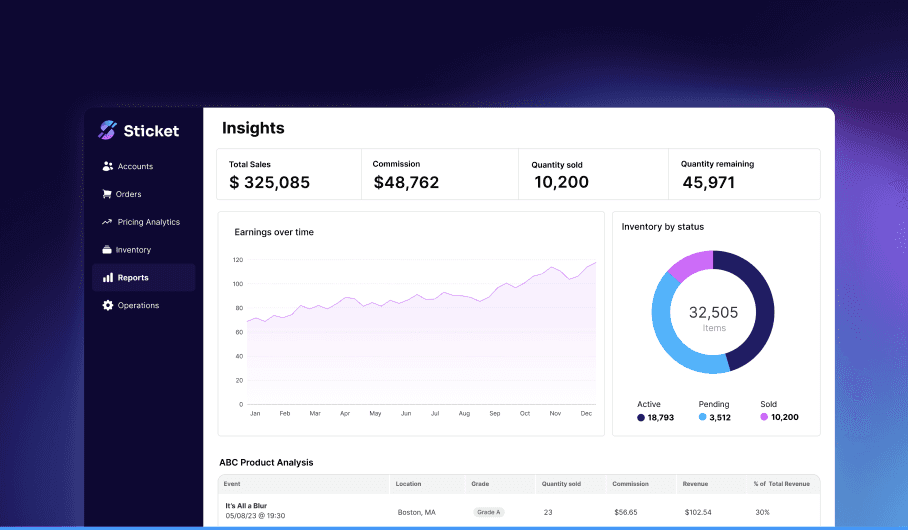
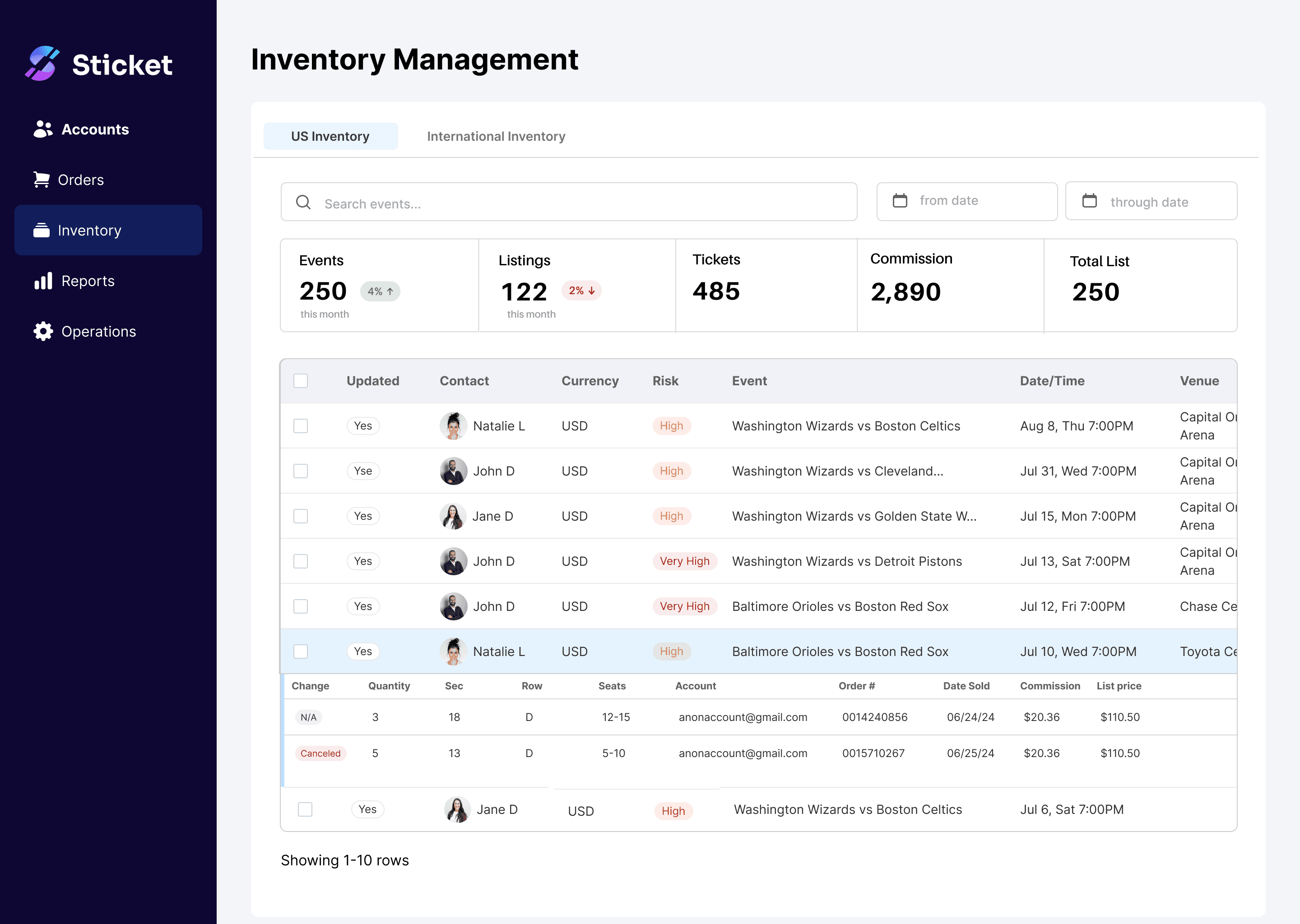
SOLUTION
DESIGN GOAL: Simplicity
Designing data tables that have too much data to be easily navigate
User Scenario
Employees needed to look up historical data from the database and locate specific entries to update, such as status or timelines.
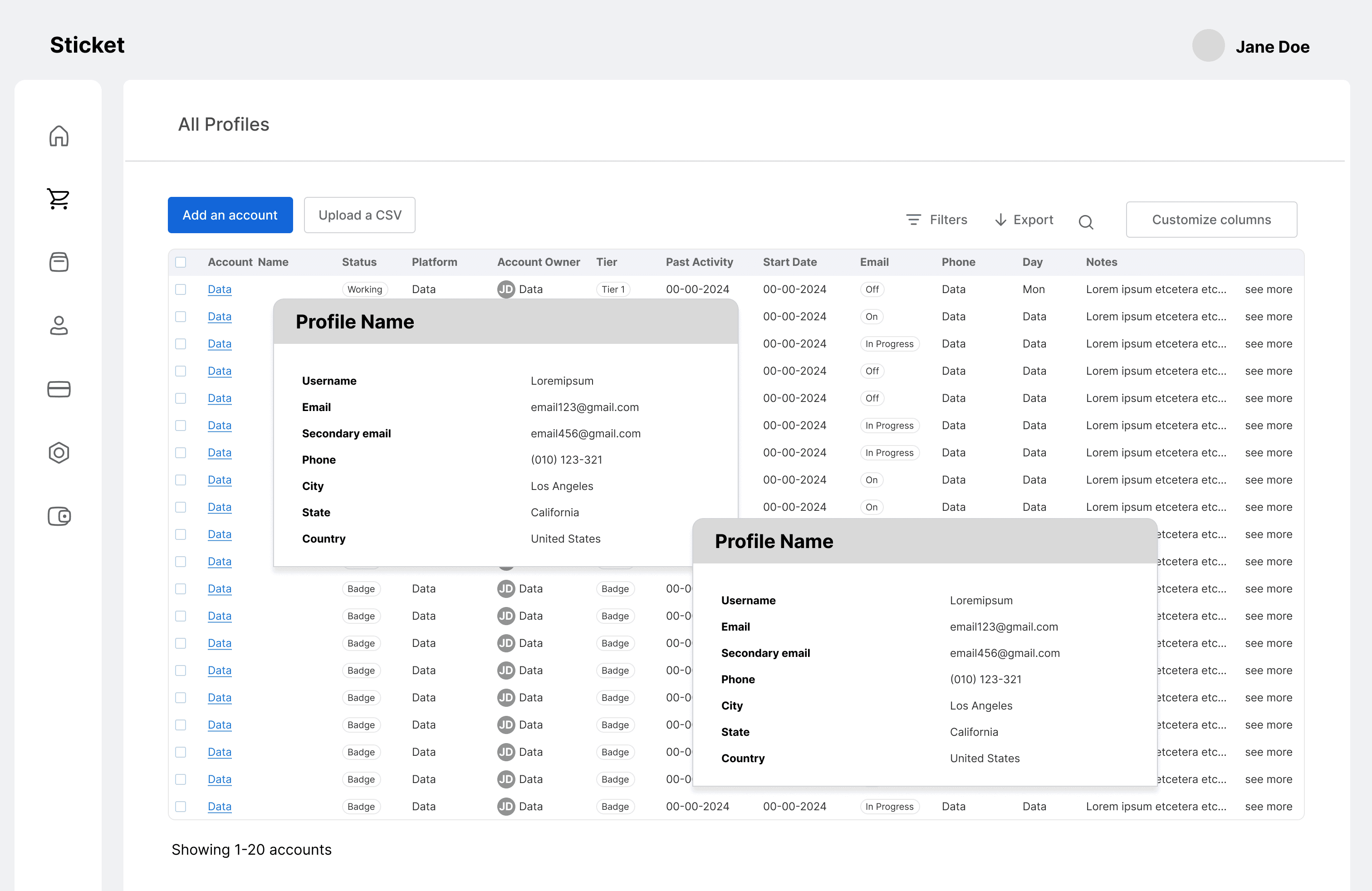
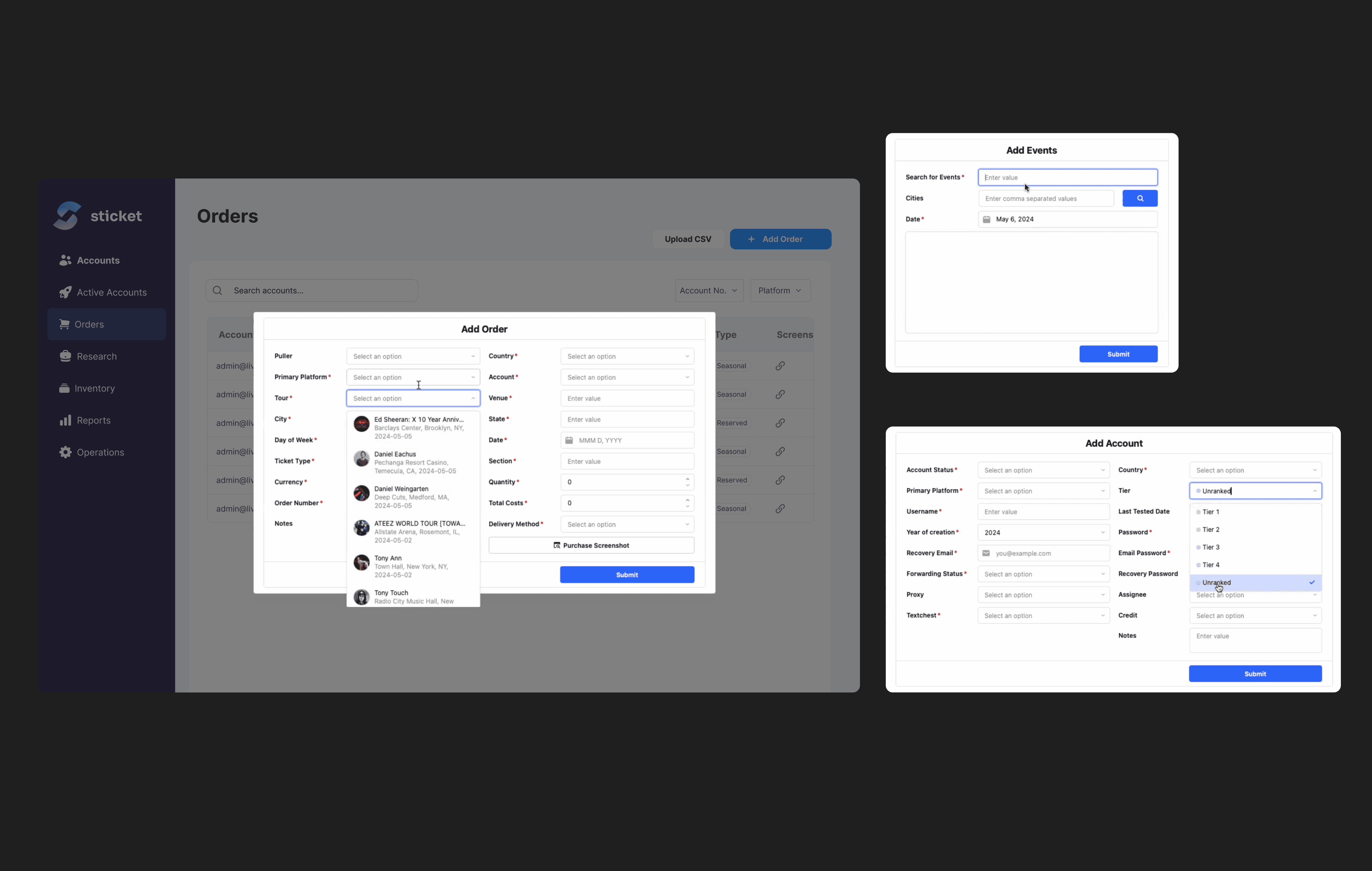
Solution
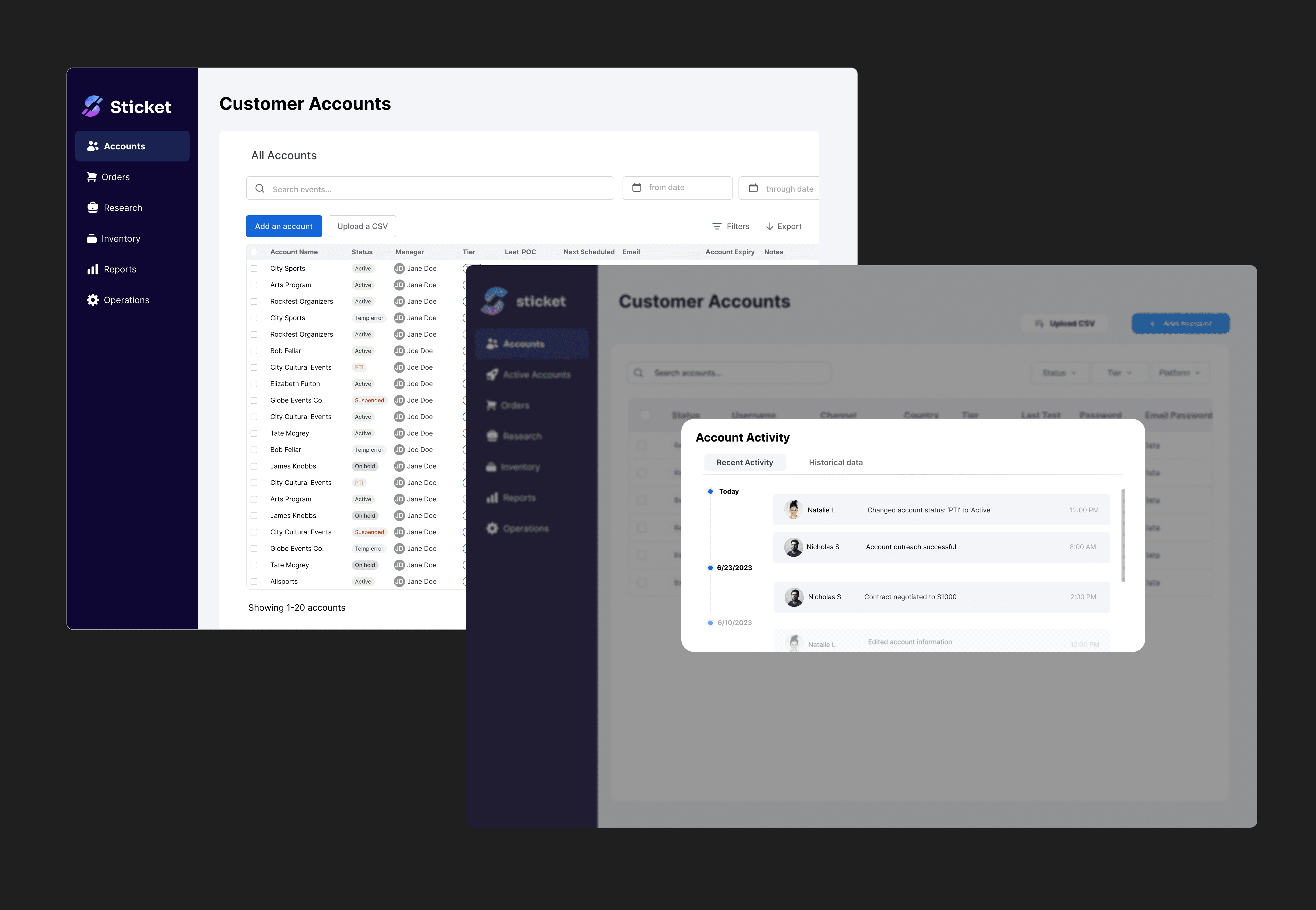
I redesigned the data tables to be more navigable and user-friendly, by bucketing labels and prioritizing the most important columns
DESIGN GOAL: Human-proof
Reducing human error by creating intuitive interactions
User Scenario
In order to update data or add new entries, it required manual entry, which is prone to oversight or mistakes
Solution
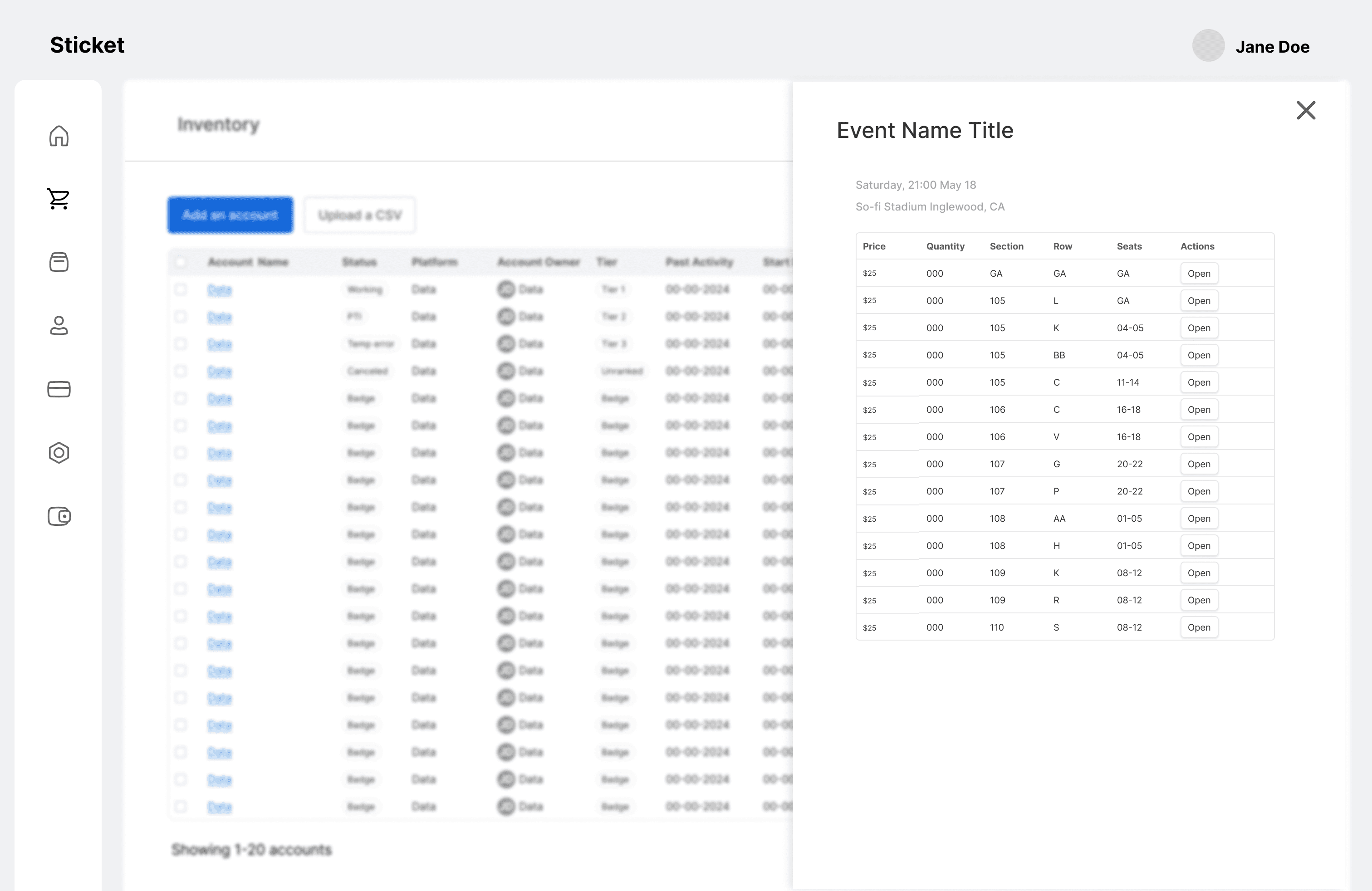
I implemented a data entry solution with intuitive form validation and cross-database field linking.
Critical actions require confirmation, while automated field population reduces manual work and maintains data consistency.
DESIGN GOAL: Collaboration
Simplifying collaboration by increasing transparency
User Scenario
Teams collaborate on sales linked under the same contract, which often required seeking out information pertaining to other teams, leading to inefficiencies.
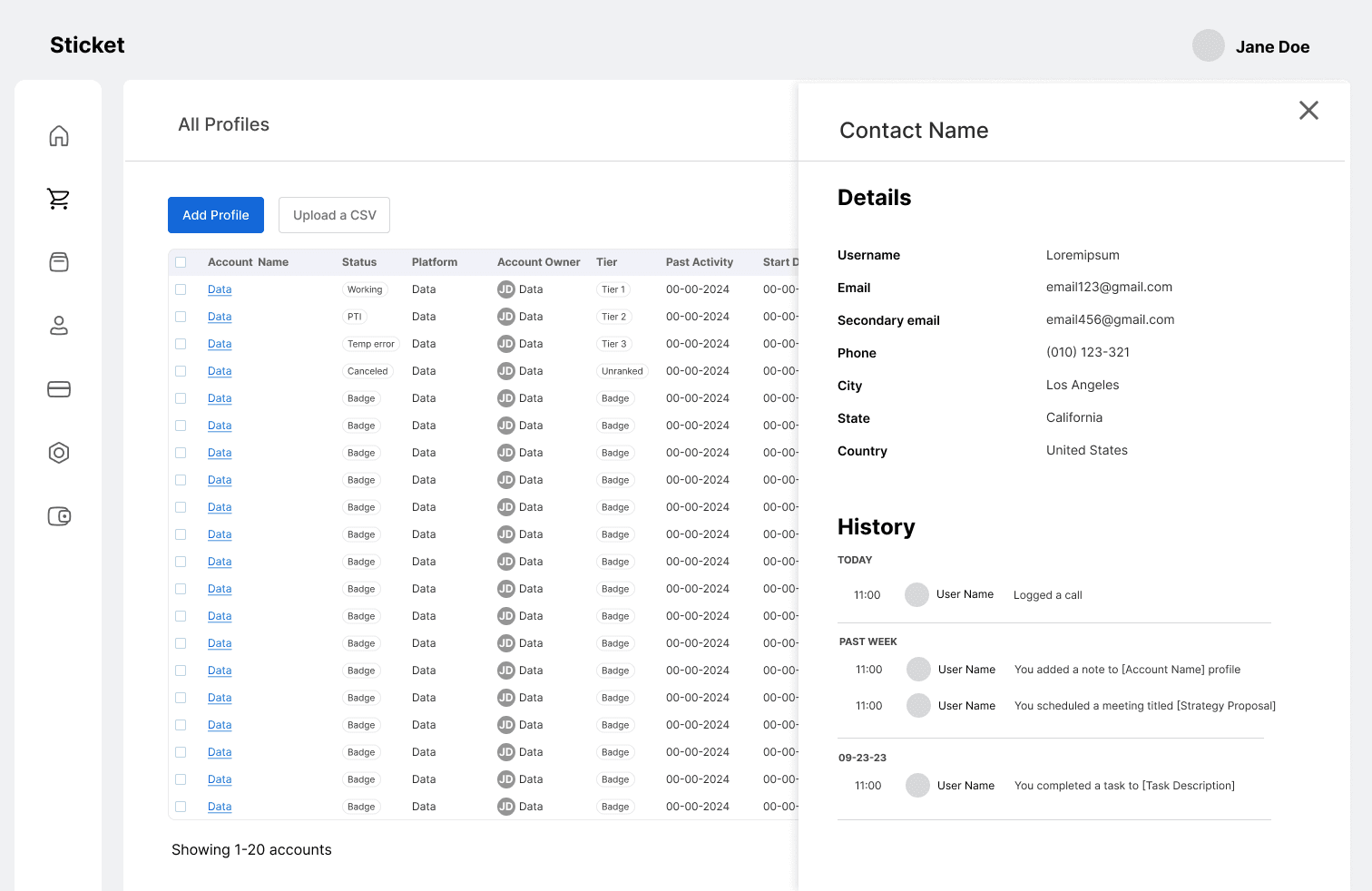
Solution
Designed an activity interface where team members can track account modifications, increasing transparency and eliminating the need to reference multiple spreadsheets.
Visual DEsign
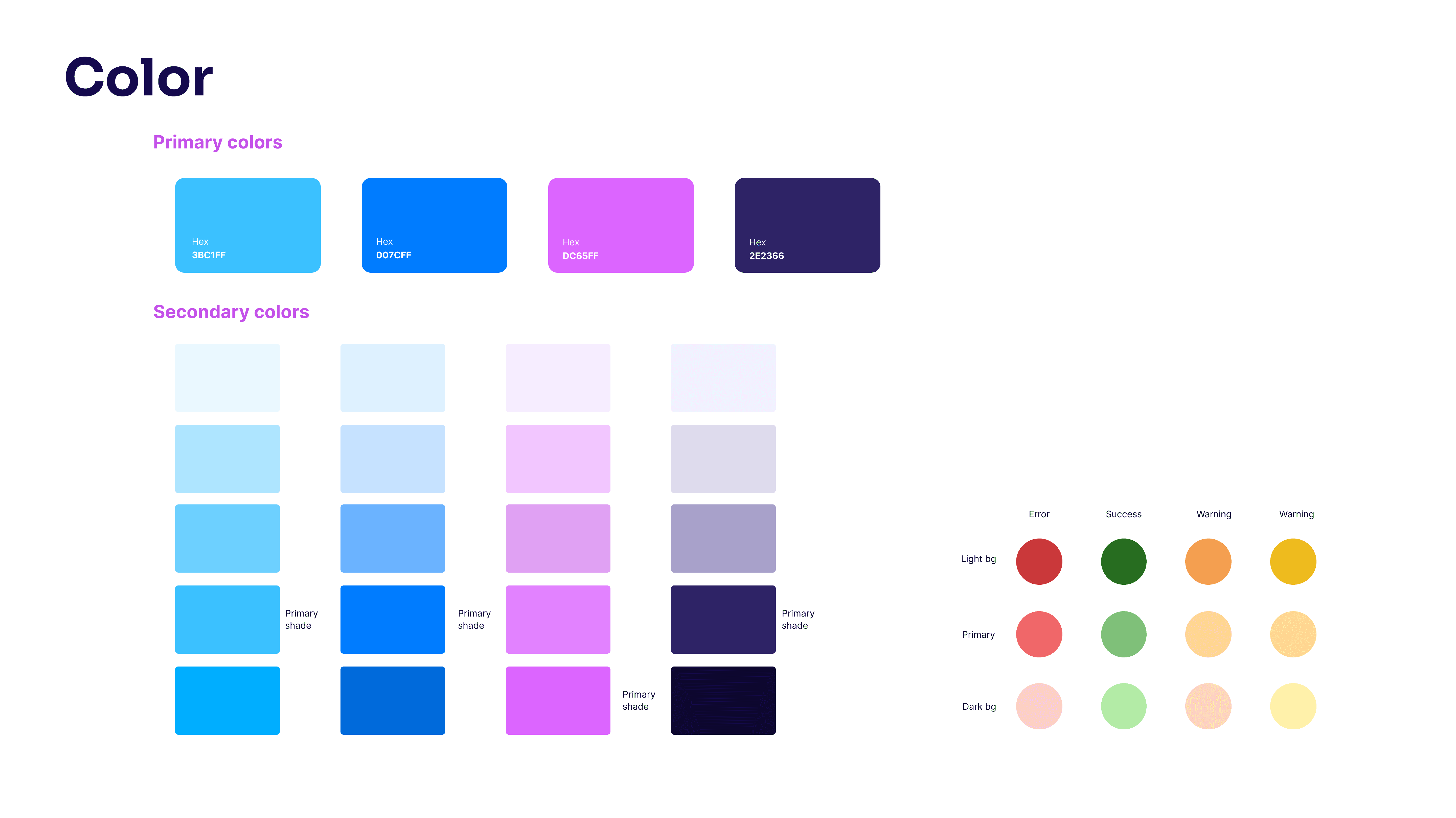
Brand guidelines
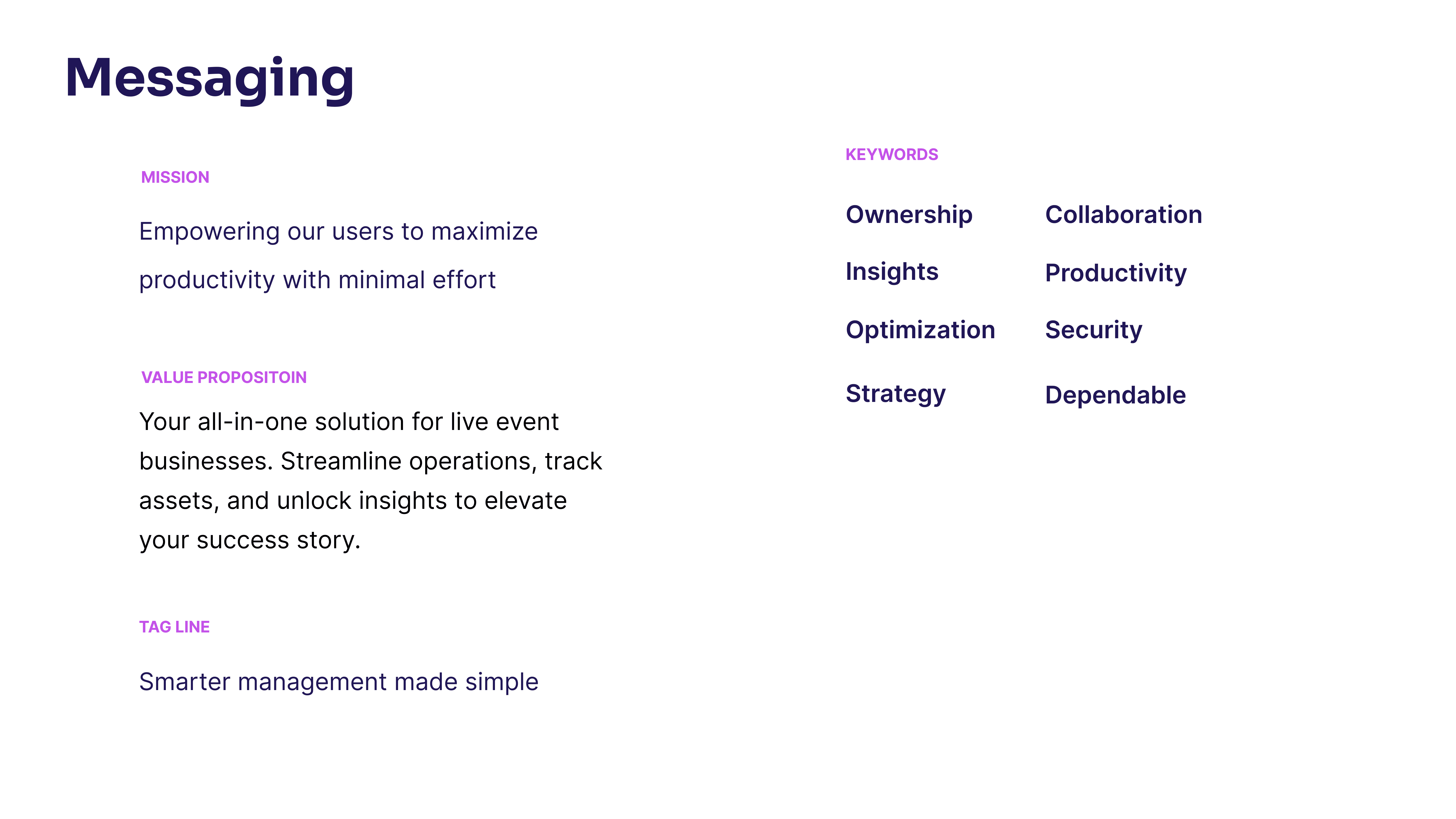
Innovative, sharp and trustworthy were the three keywords that I wanted to achieve in the brand's visual design.

Landing page
WRAPPING UP
If I had more time, I would implement the following test to validate my designs
Method
I would run a usability test with a member from each of the four teams and use scenario-based questions that focus on realistic tasks they complete day-to-day. Results would be measured through task completion metrics, Likert scales, and qualitative feedback.
Success metrics I would track
Time reduction
Reduced number of documents
Error rate
Learnings
Continuously align priorities
Where every team member's time is stretched thin, it can be challenging to prioritize and schedule interviews, feedback and testing
Meet stakeholders where they are
Most non-designers don't want to use Figma or learn it. Capture key information—such as job stories, current flows, priorities, and timelines—in documentation first, then proceed to Figma.